Today, November 15, marks GIS Day 2017. This little known “holiday” began in 1999 to celebrate GIS, or geographic information systems, a system for working with and presenting geographic or spatial data. GIS allows us to visually examine trends, patterns, and relationships between different datasets. So why are we here at ICPH excited about it? We use GIS regularly in our work!
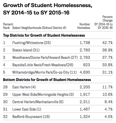
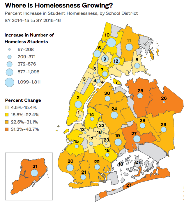
We use mapping to help us show where homelessness is. As shown in the newest Atlas of Student Homelessness in New York City from August 2017, there are homeless students in every school district in New York City, with every district seeing an increase in student homelessness between SY 2014-15 and 2015-16. While a data table could provide this information, adding the data to a map helps us demonstrate more easily where homelessness is growing the most. This allows for a comparison across the city without diminishing the fact that homelessness continues to be an issue everywhere.
GIS can uncover and display trends. For example, by mapping the location of New York City shelters, we found that they tend to cluster in certain neighborhoods. A large percentage of family shelter units are located in the south Bronx and central Brooklyn, with 33% of the units in just four city council districts in the Bronx. Meanwhile, there are 17 council districts without any units. Those areas still have family homelessness; however, those families either enter shelter outside of their districts or live doubled-up with other families to stay within their communities.
Beyond the clustering of shelters, there is also a trend in the type of shelter found in each district. Cluster sites were found mainly in the Bronx and central Brooklyn, while Tier II shelters were the most common shelter type and found more widely throughout the city. With the announcement that cluster sites will be phased out by 2021, it will be interesting to see how this affects the geographic patterns of family shelter locations.
In addition to producing maps in our reports, ICPH has been creating interactive data apps using GIS. Our interactive maps give the user the power to explore the data on their own. Currently, we have the award-winning New York City Interactive Map of Student Homelessness and Homelessness in California: Where Homeless Students Attend School. With the NYC map, you can zoom into your area of interest and see data on student homelessness by school. In addition, you can locate the community resources available in the area. Drilling down to such a hyper-local level allows you to discover what homelessness looks like in your backyard, while also comparing available resources between districts. Are the resources in your neighborhood lacking?
The California map takes a different approach, allowing you to explore California’s overlapping school districts, or LEAs, and see trends across a larger area. Interactive maps give us the chance to show a lot of data at once, which is useful with overlapping districts and other instances where static maps are limiting.
Homelessness is found all over the country, but it can be difficult to visualize what family homelessness really looks like. Using GIS to map trends such as where shelters are located, where living doubled-up is more likely, and where families are severely rent-burdened can help put the issues into perspective.
Kristen MacFarlane, Senior GIS Analyst